.png)
compass u - university of arkansas
.png)
timeline
AUG - DEC 2023
.png)
tools
Canva, Figma, Excel, Powerpoint
.png)
team
1 Designer
1 Manager
1 Accountant
objectives
-
Create a new product targeted towards college students
-
Build a brand and logo
-
Create a prototype
first steps
The first step in this process for my team and me was to develop a product designed to enhance the daily lives of college students. Recognizing the challenges students face today, we set out to create a comprehensive navigation app that integrates the various tools students rely on to manage their daily routines. Once we finalized this concept, we prioritized identifying key features that would provide the most value to our early adopters.
required elements
Our elements were based on our experience of college campuses and the difficulties which came with it.
1. Indoor-Outdoor Wayfinding: Our main function would be a GPS tailored to each college campus, being able to not only locate buildings on campus but also locate classrooms within the building.
2. Schedule Input: Allows students to input their class schedule. Once their schedule is in the system the app will alert them 15-60 minutes before their class to leave their location and aid them through the GPS system to help them arrive at their class on time.
3. Event Schedule: Knowing students have social lives that they have to integrate within their schedule, this feature would allow students to add events or register events to their schedules in order for all events to be located in one place.
4. Busy Meters: Allowing students to understand the study locations around campus and the volume at each location based on individuals in that current spot.
beginning the branding
It was very important for us to not only stay gender neutral as a brand but also to keep a basic color scheme in order to not represent a certain school. We wanted individuals to understand our brand easily and not have to dive into deeper meaning. After many different ideas we landed on the name Compass U in order to represent the navigation aspect of our app as well as the inclusion of all students.
name decision
We wanted our name to surround navigation as well as college. The name Compass U described our product exactly. Combining the word compass to relate to our main GPS function and U to represent any college or university shown on our app.
logo design
Our logo needed to encompass our brand as a whole. Allowing users to quickly understand our mission and brand based on one simple photo. This was not an easy task and required us to creatively think about which elements we wanted to include in the final design. We went through various versions featured below.

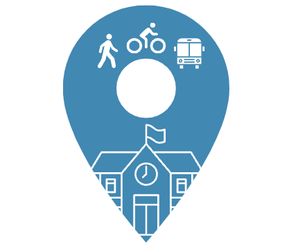

final logo


creating the prototype
Our team wanted to design a prototype to be used on a trial basis from our classmates. Our elements for the prototype are as follows.
1. Color Scheme: Clean, blue, calm
2. Elements: Home screen GPS & schedule, events tab, study spot tab, dining tab, and schedule tab
3. Fonts: Sleek, simple
the prototype
Using Figma as my tool I was able to create a working prototype to be sent out through email to the class on the day of our presentation.

my takeaways
This project allowed me to expand my knowledge of tools used for UX design. I learned how elements can support a brands story and support a target market. I was able to understand types of icons and how a user believes it functions based on previous experience i.e. hamburger menu.